Infusing your life with vibrant hues opens the door to a whole new kind of magic, as Julia Green has discovered.
Whether you are a colour lover or pick from a minimal palette, whether your preference is for Scandi or coastal style, or even if it’s a mishmash of themes, interiors have never been more personalised than they are right now.
Like anything style related, interior trends are, of course, subjective. While some may embrace eclectic patterns and palettes with enthusiasm, others may introduce them gently. Don’t be afraid to add a little bit of daring and individuality to the interior mix – it doesn’t have to be permanent. Trends will come and go, and if you don’t love it, you won’t want to live with it. Draw on what speaks to you.
Follow the rainbow brick road
The beauty of colour is certainly always in the eye of the beholder. Its subjective nature means that what one person likes, another won’t. Once you have nutted out what colours are right for you, it’s a matter of where and how to add them into the mix. Here are some tips to get you started.
Find your colours
Colour, and how much you use it, is entirely personal. There is no right or wrong, but the key is to commit to it.
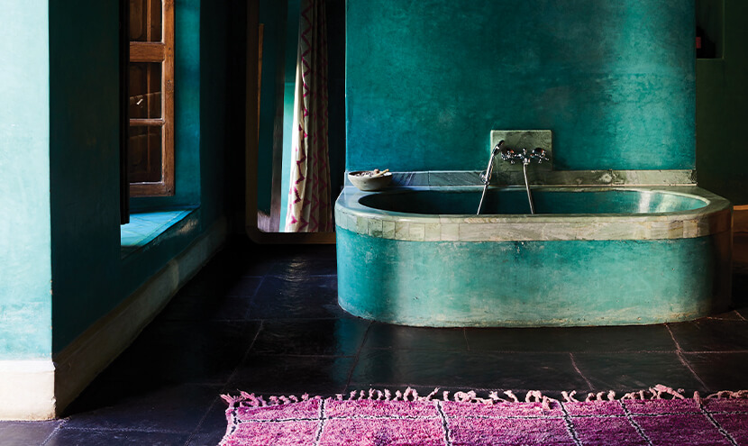
Try using variations of your colour choices as accents throughout a home to create a considered and unified look; for example, if blue is a key colour in your interior, you can continue the palette with teals and greens. Further visual appeal can also be achieved by incorporating textured fabrics and finishes – linen, timber, or stone can all diversify a consistent aesthetic.
Of course, contrasting colours can create even more visual interest. If you are not confident to mix colour combinations, colour authority Pantone has created an app, My Pantone, which does it for you. It takes the science out of colour selections and offers advice on complementary colour schemes.
Understanding industry terms
Terms such as tint, tone, and shade are regularly referred to when discussing all things colour. It’s worthwhile getting to know what these terms mean. That way, you’ll have a better understanding of applying colour in all its forms to your interiors.
Essentially, tints, tones, and shades refer to the variations in colour when white, black, or grey are mixed in.
A tint is a lighter version of a colour, created by adding white, and can be quite calming. Pastels are a good example of this.
A shade is a darker version of a colour, created by adding black. Navy – the result of adding black to blue – is a classic shade.
Tones denote the addition of both black and white (grey) to a colour and can be darker or lighter than the original hue depending on the proportions of grey added. Often referred to as muted tones, these hues are more subtle than tints and shades.
Take your time
If you are a little afraid of colour, go slow, go small. Add measured amounts of it to start with and live with it for a while before deciding on how much more to add or subtract.
As you grow in confidence and you learn what works for you and what doesn’t, you’ll be waving your colour wand with authority.
Have a plan
Before you start, think about the mood you want to create in each space. For instance, if you are after peace and tranquillity in the bedroom, avoid bright colours. Colour can turn the volume up or down, so use it to your advantage.
Allow colour to pop
Think about going for dark walls rather than white. While a white wall will certainly provide contrast for bold colours that are used throughout your furnishings and decor, and have a fresh feel, a moody hue will showcase colour even better.
Variations of hue
If colour mixing isn’t your thing, it can be equally as effective to stick with a single hue. If you prefer just one colour, try using it in different shades for maximum impact. For instance, a graduated ombre effect can be very striking and is always complementary.
Timeless combinations
If you feel bright colours are a bit too much for you, opt for more timeless combinations such as black and white, which still pack a punch decoratively and tend not to date.
Try something new
While tried-and-true colour combinations do work supremely well, at times something more imaginative is called for. In fact, more unexpected combinations can work incredibly well, and often a soft mixed with a bold packs some extra punch; think terracotta teamed with cobalt, or teal mixed with mustard. One of my go-to combinations is a soft duck-egg blue and a punchy chartreuse – this is a surprising combination that seriously rocks my world. It’s all about these hues being total opposites – and opposites attracting. I need only think of one of my favourite decor pieces, a two-toned velvet cushion, to be reminded of how well this unlikely duo works together.
Triple threat
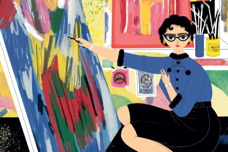
Art is a wonderful focal point with which to ground a space. You can make any room feel well thought out by pulling out colours from an artwork; that, in turn, will make your colour choices feel more cohesive. Then repeat that colour in three places for unison in the room.
This is an edited extract from Vivid: Style in Colour by Julia Green. Photography by Armelle Habib. Published by Hardie Grant Books, RRP $60. Available in stores nationally.


